Houzz

Today's Ideabooks
Browse Bedroom Products on Houzz- For Example:

Thursday, February 24, 2011


I always like the look of a cold and dull looking room; it gives me a chance to work some creative magic and make it into a warm ambience with depth and balance. The use of a combination of hard and soft colors here creates some contrast while adding to the look and feel of the room as a whole. I added a touch of dark woods to compliment the floors and keep all the layers balanced by using it throughout the room. Over all I think the room has a nice flow and gentle order to it, that is warm and harmonious to the eyes.

Monday, February 21, 2011

The Unique Concept of Living- Cluster Coffee Tables


I love the unique approach of tailoring a room to augment the interior concept of the home with a cluster of coffee tables, which is one of my favorite ways to express myself. Every home holds characteristics of ourselves and our own unique style and is a way for us and others to enjoy the special effects and our tastes and the statements we make.

When arranging cluster coffee tables, I simply choose and arrange a selection of small coffee tables that appeal to me and I think would intermingle nicely. Each of the tables are different and add an interesting perspective to the room as a whole. The combination of each piece in turn creates a complete concept that makes the room different and unique.

The group is simply created by putting some time into each individual piece, decide what it should mean and how it should look and then piece each of them together to create an entirely new design for a creative concept and creative style of living.

Tuesday, October 12, 2010

L.A. Times Blog

Yesterday we were featured in the Home and Garden Section of the LA Times Blog.
Click on the link below to read the article and see a few snapshots of one of our latest projects!


Tuesday, September 14, 2010

Murakami at Versailles


Sometimes its those very strange combinations that really show some true genius and i think that the new retrospective of Murakami's at Versailles is one of those moments. He had an exhibit in Los Angeles about a year ago, and it was beautiful, but in a gallery setting the pieces are left cold and isolated. However in the grandeur of Versailles they seem oddly right at home. The show is opening this week and is open for three months....hmmmm maybe a trip to Paris is in order!!

Monday, September 13, 2010

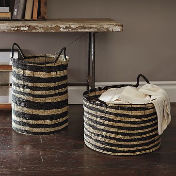
Some Great Baskets


We are always on the look out for great baskets. We use them in many rooms throughout the house, in the Living Room for firewood, Family Room for magazines, towels in the Bathroom and toys in the Playroom. When I look for baskets there are a few things that I look for:
  • I always like a real handmade feel
  • A sense of age and time worn look
  • A generous size to act as a catchall

All of the ones pictured are from West Elm, they have a great selection at the moment and i am sure going to stock up, I think you should too.

Wednesday, September 8, 2010

Esquire Show House 2010


We were very busy today installing at the soon to be open Esquire Show House in Los Angeles. Unfortunately it will not really be open to the public, but open only for a select few charity events.

The room we are doing is in conjunction with Corum watches, and we are thrilled to be working with them. They are famous for watches thats yachtsmen swear by, so we have created a loosely nautical style Study that pays homage to that without looking like Long John Silver.

We will be complete tomorrow and photographing on Friday but here is a quick sneak peak.

You can't see much from this image, but a few details you can pick out, such as the vertical mahogany panels with the stainless accents, as well as the great painting by Luc Leestermaker.

Tuesday, September 7, 2010

House Beautiful 500 Paint Colors


So my new favorite IPAD app is by Zinio, and for those of you who want to see the future of the publishing industry its there. This App allows me to read ENTIRE magazines, front to back, including ads, but not just a paltry few, a mind blowing array of titles from general interest to home decor. I can now safely go off to a restaurant to eat with 20 magazines safely downloaded to my IPAD and flip through them at my leisure, it's my guilty pleasure!

Anyway last night I bought on Zinio a bookazine from House Beautiful, featuring the favorite colors of some of my favorite designers. After skimming the pages I saw there was a quote there from my favorite designer of all....ME!

Her's the quote "I have one of those little green boxes from Laduree, the Paris pastry shop, on my desk. Turns out my client has one too, and we recreated that Laduree green on her Kitchen island. It's an incredibly complex color, a weird combination of yellow and gree with this red undertone. Beautiful"

In case you want to check out the color it is:
Fine Paints of Europe
P11130