Houzz

Today's Ideabooks
Browse Bedroom Products on Houzz- For Example:

Tuesday, October 25, 2011

Some of My Favorite Dining Rooms

Dining Rooms are some of my favorite rooms to design, because they can be light small flights of fancy. I really like to entertain, so creating a room where you hang with your friends on special occasions are very special events for me. Here are some of my favorites:

This one is in an old Hollywood mansion that we remodeled for a client who was a writer. So we decided to move the Dining Room into the Library. Unfortunately when we shot this for Met Home, they wanted clear shelves, but normally this room is full of books, which makes it a very cozy and inviting Dining Room to be in. 

I always like the contrast between old and new and in this home , we deliberately created an older Tuscan feel and then used cleaner more modern furniture. The chairs were from Hinson and the chandelier was Dessin Fournir.

We have newer Italian modern chairs in this room now (I need to get new pictures), but this room is a great collection of pieces, a chandelier from the South of France, a ruf grom Tibet with a huge Floral pattern and a modern Industrial table.

This room is interesting, the architect designed a two story high Dining Room, which felt a little stark, so by using a linen sheer we were able to create a lower ceiling that felt almost like a wonderful tent. The polished concrete floors add a little sparkle too and stops the room from feeling too feminine.

Friday, October 21, 2011

Trolling 1st Dibs

I was watching TV the other night, and one of the characters walked into her office, took off a jacket and hung it on a coat rack. It struck me that it has some time since I have shopped for said item, so I thought it would be the perfect subject for my 1st Dibs trolling session. Let me also say that I am not a lazy coat rack shopper, I just happen to live in sunny southern California and no one seems to wear coats, so no need for a rack it seems.....

Denmark
1950's
An elaborate hat and coat tree with sculptural turned teak tapered dowel posts on an x-form base.


United States
Early 20th century
A versatile and functional halltree. coat rack, umbrella stand all in one.


USA
1820 to 1860's
Ten-horned hat stand with mirror, horns have original rounded metal tips, mirror is beautifully aged with inner gold leaf accent framing, original finish has deep sepia-tone. Horn avg. is 10 inches. Mirror diameter is 11.5 inches.


france
1940
French Art Deco Coat Rack


Thursday, October 20, 2011

Guest Post- 3 ways to Decorate Outside


If you’ve spent any time at all looking at decorating projects for your outdoor living space, you know how much time and money it can take. When you start adding up the cost of all what you want to do, it can be a truly staggering sum! But it doesn’t have to be that way. With a little creativity, there are tons of options for decorating for less outside the home. Here are 3 of our favorite ways:

Change The Small Stuff (Finish, Pillows, etc.)
            -           Perhaps you’ve got a sectional outside that you just don’t think works with the area anymore. Or maybe you have a glider bench that’s starting to show its age. What do you do in this situation? Purchasing new furniture can be very expensive, so that’s out of the question. The solution? Change the small stuff. By changing the accessories to an item, you can upgrade its look and give new life to something old. For the sectional, you could change out the pillows on it to seasonal colors. With the glider bench, a new finish will have it looking great and take years off its appearance. The best part about both these options? They’re much cheaper than buying something new!

Repurpose (tin cans for lanterns)
            -           Another great way to decorate for cheap outdoors is to repurpose items around your home. Not everything out on your patio has to be new, and by putting something old to a new use, you’ll create a unique, one of a kind environment. For example, a drape that no longer matches the furniture in your home’s living room might look perfect when hung from one side of your pergola. About to throw away some old tin cans? Save them, paint them, create designs in the sides using a knife or nail, and you’ve got a great set of candle holders!

Faux Greenery
-           Faux greenery is most commonly used on the inside of the home, but it can work just as well outside. Whether it’s arranged in a window planter, a hanging basket, or a traditional urn, it gives you an easy way to keep some color in your outdoor area all year long. Plus, you can always bring your planter indoors if you want to add some greenery to the inside. When you consider the lack of maintenance (no need for fertilizing or watering) and the fact that it can last through all seasons, including fall and winter, it makes it an obvious choice for pairing up with your favorite annuals and perennials.

While decorating an outdoor living space may seem like a costly, time consuming task, it doesn’t have to be. Keeps ideas like these above in mind and you’ll be able to decorate your outdoor space and have it looking fabulous without breaking the bank!


About The Author – Marissa Alan is a writer with Outdoor Living and loves to talk decorating (indoors and out), gardening, and healthy living. For more on items like outdoor fountains, planters, and heating elements like outdoor fireplaces and a wood burning fire pit, visit OutdoorLiving.com.

Monday, October 17, 2011

In Defense of Quality


It is always with great fascination that I read the plethora of articles that extoll the virtue of spending less. It seems that every magazine or blog has articles about getting the “same” style for less. They have alluring images of great design pieces (that have equally great price tags) and then they throw in some images of things that have the same look for less.

What really is the message here? Is it that good design and quality are totally divorced from cost? I would like to make the case that this is true. What you are not seeing in those images that are usually beautifully shot photos (perhaps retouched as well) is the true difference between the high and low price points.

Here are a few things to bear in mind next time you think that you are buying a bargain piece:


  • ·        Longevity, I always encourage people to buy pieces that will last if not a lifetime, but many years. I am reminded of those beautiful images of Billy Baldwin’s apartment in New York. It went through two or three major redecorations, but if you look at the images it’s the same pieces, moved to different locations, reupholstered or refinished, this is precisely because they were of a high quality that they could be used time and again.

  • ·         My motto when designing is “The Luxury of Simplicity”. So I am not a fan of buying a lot, since that is the case, buying fewer higher quality pieces will not only allow you to appreciate them better but it also gives you the opportunity to build  a collection of pieces that really resonate with you. I love it when I visit homes and the story of the people who live there is told by the pieces they have collected. I don’t want my story to be “this is almost what I had in mind, but it was less expensive”

  • ·         When you decide that things are going to be with you for a long time, things like quality of construction, such as 8 way hand tied upholstery, or quality of finish, become very important, because it’s the subtle details that you notice over time that really make you attach to the piece.

  • ·         My last thoughts on the matter have to do with a sense of confusion I have about this phenomenon and how it continues, wouldn’t it seem strange if Kia had a campaign that you should buy their car cause it sort of looks like a BMW? Or would you buy a fake Rolex? All of these things you spend less time with than the things in your own home….. Embrace the Quality!!!

Wednesday, October 12, 2011

Powder Rooms

When I am designing a house whether it is in Los Angeles or anywhere around the world, one of my favorite rooms to design is always the powder room. It is one of the few spaces in the house where function is so limited that it frees you up to explore almost any fantasy.


I have a few examples of some of my personal shown below. You can tell I am a fan of wall decoration and trying to find things that are unusual and unique.
This is a home by the beach, but we wanted to do a more sophisticated feel, so the paneling painted black really added some formality and then a collection of old prints of a variety of coral gave us just enough of a nod to the ocean for it all to make sense.


This home was in Northern California and I wanted the room room to have a carefree formality. The wallpaper gives it a bright, garden quality, but the crystal bird sconces stop the whole arrangement from getting too cutesy. Instead of a framed mirror I just mirrored the whole wall, which simplified the design and opened up an otherwise small room.

Friday, October 7, 2011

Trolling 1st Dibs

Fridays are great days to spend some time catch up on the flotsam and jetsam. There is no better place than that than 1stDibs. I especially like the more esoteric things you can find, today I was in the Outsider and Self Taught Artist section, there are some cool things here. I am totally in love with the Ruler Bouquet!
 A Bouquet of Folding Rulers
U.S.
21st Century
An original assemblage of vintage folding rulers. Can be adjusted as needed.


Price
$900

USA
21st century
American
2011
Tennessee
Oil and graphite on plywood.

Price
$4,500


U.S.A.
1995
Howard Finster is perhaps the most famous self-taught artist of all time. Born in Alabama, he attended school for 6 years. Howard married Pauline Freeman in 1935 and had 5 children. He was a jack-of-all-trades: house painter, bicycle and lawnmower repairman-anything to support his family. Howard was a Baptist Minister for about 40 years until, in 1965, he realized no one in his congregation was listening to him. At this time he was directed by the Lord to transform his swampland in Pennville, Georgia into Paradise Garden. In 1976 an angel appeared upon the paint on his finger and said“paint sacred art”.
Howard never stopped. He was inspired to get out the Lord’s message. Finster was a master promoter. After his first dealer, Jeff Camp, failed to sell his painting, he found Phyllis Kind who brought his work to prominence. Finster and his family produced some 50,000 works many of which were signed, dated and numbered.

Price
$3,000


U.S.A.
c. 1950's
Variable Speed Control | Working Mechanical Carousel with Animals and Men

Price
$5,000


Wednesday, October 5, 2011

Pink Makes me Happy


It's raining in Los Angeles today, something that rarely happens at this time of year. 
Pink Makes me happy :)


Tuesday, October 4, 2011

Tuesday Book Review: Home Sweet Home by Oberto Gili


The experience of a lot of really great interior design for a lot of people is through books and magazines. By necessity then, their experience is seen through the filter of a photographer, and what better lens to look through than Oberto Gili.

Gili has been documenting interiors since the 1970's and his eye for the dramatic and unexpected creates not just a wonderful photograph but a tangible experience of what that space would be like.


Another great feature of this book....no text! Now I don't even have to pretend to have read it all. In fact, too much verbiage would get in the way, when you look at the projects you can almost tell the story just from the pictures.


There are many favorite projects here but two really stand out. One is the apartment of Richard Meir the other, the painter Ellsworth Kelly. Both of these chapters manage to tell the story of two huge personalities through small vignettes and insights to the way the relate to their built environment.


So if you are like me and enjoy a voyeuristic tour of homes of the likes of Renzo Mongiardino, and Isabella Rossellini you will definitely enjoy this new offering by Rizzoli. It comes out this month so look for it, it will make a great addition to your collection.

Monday, October 3, 2011

Interiors Magazine

It seemed that for a long time you knew just what to expect from Magazines, each issue was essentially a version of the one that came before it. Then the huge shuffle occurred and it was hard to keep up with who was where, and who was staying in business and who folded. Well out of all of this came Interiors Magazine. It seems that this was a magazine that never really got a lot of traction, but in the last few months it has pretty much reached the top of my monthly must reads.

This issue is no exception. Michael Wollaeger  who was featured on this blog when he was Editor of Western Interiors has transformed this magazine into the bright shining upstart we have all been asking for. With a collection of amazing projects Vicente Wolf and several others and Photography by Tim Street Porter and John Ellis (two personal friends and design favorites).

Well congratulations to everyone at the magazine for an amazing job, it gets better with each issue. Now run out and buy a copy, this is one to support.

I should also mention here too,,,, one of my pet peeves is most magazines do not show the outside of the houses, so there is no context. Not the case here it is about the WHOLE home.


Lamps Plus Interview

Today my Interview with the Lamps Plus Blog was posted.

I am a big fan of Lamps Plus, they offer a huge variety of manufacturers and they have great customer service as well!

The Interview talks a bit about my philosophy of ""The Luxury of Simplicity" and a variety of different inspirations and obsessions. I hope you enjoy!

Wednesday, September 28, 2011

1st Dibs Finds


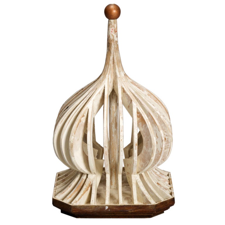
I Love 1st Dibs, and one of my favorite aspects is the sheer number of categories of things that are available to see. Today the section I want to show you is the Architectural Models section. I think that models are really great things to use in an interior. Whether its a stair model used as a lamp (like the one shown above) or a great antique from the Grand Tour, they all tell a great story and add depth of history to an interior.
downloading...
This is a Model for a Cupola
Marble Model of the ruins of the Temple of Vespasian
At 16" tall I think this (which is a souveneir of the Grand Tour) would look amazing  on a table in a contemporary Interior.

Tuesday, September 27, 2011

New Must Have Book

My favorite type of design books (and I have a million of them) are the ones that make me look at the subject in a whole new way. If you are like me, then you are going to LOVE the new book "Louis Vuitton Architecture and Interiors".

I have been a fan of the way LV has always been able to present a consistent design message with a few key iconic symbols they are able to deftly weave consumer products, architecture and interiors creating a message that not only reinforces the brand but also sends it in exciting and unusual directions.

This book is broken down by location, then at the end dedicated chapters to Skins, Facades and Signage.


The book has some great photography, but some equally interesting interviews with the architects for each of their signature stores. One of the more interesting aspects were the photos of the exteriors taken in a way to show the context of the store with the surrounding city (the image of the Moscow Store with St Basel in the background is a notable example).

Wednesday, September 21, 2011

Keeping it Small

A lot of times you will hear people say that if you are working on a small space, you should paint everything white, or at least light. That it will make the room feel bigger, well I don't think making a space feel bigger should always be the goal. This is a room I did that used to be the closet under the stairs and is now a cool, fully functional home office. It is only about 6'-0 x 8'-0" but with the right attention to detail, and distilling out all the superfluous stuff, it actuall feels about right.

The chair is a personal favorite it is on a track and can actually recline waaaay back. The desk by Antoine Proulx is cool too, as it is very open and the white wood makes quite a chic statement.

Monday, September 19, 2011

Just because it says WALLpaper it doesn't mean it won't look good on a ceiling!

I have been a huge fan of Lori Weitzner now for a while. I think that she brings such a cool fresh thought to all that she does. so I thought she was a perfect example to use for this post, because I think she would appreciate the idea of wall paper on the ceiling.

In this home we had an existing raised ceiling in the Dining Room that I wanted to find a way to highlight. I found a drawn plaster series that Lori has that is perfect for this kind of use, we installed it and then had a faux finisher add a subtle iridescent wash over it. It provided just enough sparkle to make the room feel more special, but with enough money still in the budget to buy great furniture.


The pattern we went with is called Cartouche. It was the right choice as it has a perfect blend of old and new and the spacing on the design was spread enough that it didn't get too busy.

Hope you like it.


Thursday, September 15, 2011

A Few of my Favorite Things....

Anyone who knows me and knows the office I run, are not surprised to find out that one of my favorite things are sneakers. A company that I fell in love with is Clae, they are a California company but make sneakers based on men's dress shoes. That way I feel like I am dressed up enough for the office but casual that I am true to my style.

Here are a few of their newest styles,,, their color sense is great.

Blakey

Bruce
Hockney

An App I can't Live Without

So it is no secret that I am a huge fan of my IPAD. I keep telling people that it answers all of the needs I didn't even know I had. And I found an App last night called My Measures Pro, that is now one of those things I am not sure how I lived without. Its a tool that helps with dimensioning.

I don't know about you, but when I am starting a project, whether its a powder room or a kitchen design, getting the as built dimensions right is the first step to a successful product.

Take a look at the screen shots below from their website, you can see just how easy it can make your life. No more chicken scratch for me, ( I can hear a collective sigh of relief from my office).

My Measures for iphone Screenshot Drawing

It allows you to organize by project etc and send right from your IPAD. My only wish was for a wider angle lens but other than that ....life changing!!

My Measures - Organize your work


Tuesday, September 13, 2011

Get to know your ABC's


I am not sure if it's because my daughter started school this week or not, but at Mark Cutler Design we are big fans of the alphabet, and one of the things I like most about it is that it is something that almost anyone can do.

The lower image is of an alphabet that is an antique print and is a bit more expensive, but the one on the top is an alphabet based on everyday images, some from street signs, some from plant shapes. It is one of my favorites because not only does it teach the letters but I would like to think it makes you look at the world in a different way too.